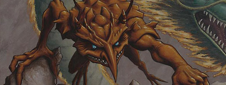
Pete Venters Interview
Welcome to our MTG Artists Interview series There’s no Magic without art.
For this week’s interview, we had the pleasure of talking with Pete Venters, an artist that is ingrained in the game’s history.
Pete started back in 1993, painted over 250 cards, developed the Creative Department, worked as a Continuity Manager, and is a goblin specialist.
Your first card debuted in 94, the game was one year old. How did you get started?
It was completely by accident. I was visiting the USA for the first time, attending Philadelphia Comicfest in October 93 where I could show my portfolio to both games and comics companies.
I heard some buzz about Magic at the show and saw their booth where they were opening packs and inviting people to take a card. One of the companies I wanted to talk to was White Wolf as Vampire the Masquerade was big news and their art was predominantly black and white which was my preferred way of working.
It took until day 3 of the show before I was finally able to catch White Wolf’s art director at his booth. He was talking with someone else so I stood there holding my portfolio until I caught his eye. When he noticed, I introduced myself and asked if there was a convenient time to show him my work. He said that he and the other guy were both art directors so I could show it to them both right now.
The “other guy” was Jesper Myrfors, the original art director of MTG. Two weeks later I received my first assignment for Magic. White Wolf never got back to me.
Did you imagine how big the game would become at the time?
I don’t think anybody could have reasonably expected it to be huge and enduring. Early reviews of the game were very exciting for it but often wondered how long it would last.
I remember attending San Diego Comicon 94 where the buzz of the game had started to make all the other companies take notice and I ended up in one conversation with some comics execs that figured the game would last about three years. I countered that I felt it could last ten but they thought I was crazy.
Do you recall your first commissions for Magic? Did you get an art description for the cards?
My first art commissions were unique because they weren’t just for one set. Wizards were scrambling to catch up as they’d been taken completely by surprise by the magnitude of demand.
I think the necessity of fixing some errors between Alpha and Beta also delayed them and then they had to get Unlimited ready. This meant that come late October 93, they had three sets ready to commission art for – Antiquities, Legends, and The Dark – and they were doing them at the same time.
This was the reason that in those three sets some artists appeared a lot in one set and perhaps not at all in another. There were no art descriptions – those didn’t really become a thing until Alliances. We were just given card titles and an explanation of how the card worked.
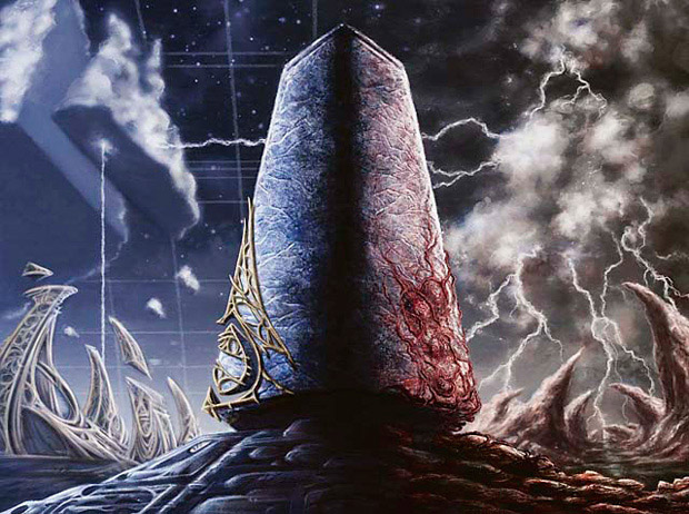
My first Magic painting was Mightstone which I completed in six hours. It looks like a sketch compared to Magic cards today.
I’m curious about that transition that happened in Alliances; over the years, how did these (and subsequent) changes impact the way WotC and artists worked?
Well, the introduction of art descriptions was in response to three factors:
1) The game had become a huge success and the number of artists being hired had grown significantly. It was no longer feasible to expect each artist to take the time to learn the game and understand what a card did from the rules text.
2) More significantly, Wizards realized after a year of releases that they had to do something about card leaks. Artists were originally given the card title and an explanation of the card’s mechanics. During that first year, artists were allowed to show artwork before it was released and this of course led to players asking what the associated card did, and artists saw no issue telling them.
It may seem crazy now that artists didn’t take secrecy seriously, but remember this was 1994, the game was a hit in the niche hobby games industry but pro tours and cash prizes were a long way off and no one thought that these card powers should be treated like a movie spoiler! In a pretty short period, artists were asked to not discuss unreleased cards, to not show unreleased art, to a full NDA.
3) Wizards were eyeing other outlets for their Magic IP. Comics, video games, movies. All of these needed the IP to become more codified.
During 95 art descriptions started to become a more structured process. With Alliances, my first set as a Continuity member, it seemed logical to let an artist be the one to write the art descriptions. How much of the art description format I inherited and how much I added is completely lost to time and my added memory. But very quickly the art descriptions completely replaced any card mechanic information given to the artists. There were hiccups though. There were a couple of sets where the art descriptions ballooned in size due to an AD’s insistence that each creature race is rigorously described. This issue was eventually resolved with the introduction of the Magic Creative Team which had Anson Maddocks, Mark Tedin, and Anthony Waters as concept artists.
Under the guidance of Chaz Elliot and a returning Jesper Myrfors, they created the first Magic style guide for Tempest. Style guides have been the essential method of communicating a setting to Magic artists ever since.
Was this a novel way of working at the time? How were other companies doing it?
From my limited experience at that time, it seemed so. Movie franchises and comic books had guides but I hadn’t seen anything entirely new created whole cloth and formatted like that before.
Now it’s common practice, I guess. Hell, when the style guide was being made, it was the first time I ever heard the phrase “concept artist”.
What was your personal favorite set to work on, and why?
It was Mirrodin block. Going into that block I never would have believed it because the pseudo-tech of the setting gave me some serious misgivings. However, the style guide included a very detailed world-building section that was meant for the novelization’s authors but I found it indispensable in understanding how the world worked.
I think that a deep understanding of the setting gave me rock-solid confidence about my pieces and I consider the Mirrodin block to be my best body of work in Magic.
You worked full-time in the Magic Continuity department, which makes you one of the artists with the most knowledge about the game’s lore and story. How did this influence your illustration work, and vice-versa?
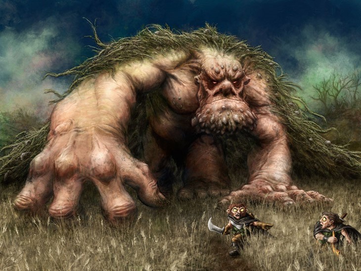
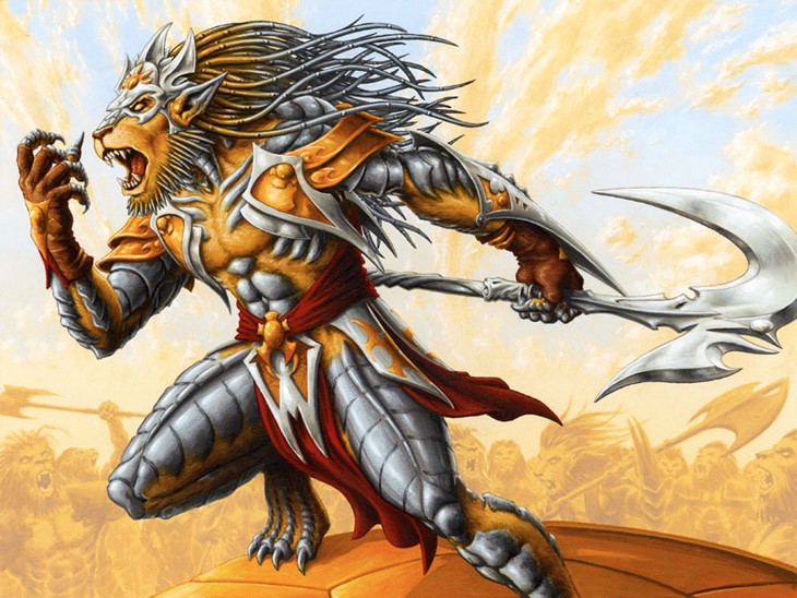
I started as a comic book artist and for me, the narrative is king. The pieces with strong narratives or strong characters were usually my favorites and produced my best work. I think of Baron Sengir, Raksha Golden Cub, Crovax the Cursed, and Pandemonium, to name a few.
As I mentioned, the more confidence I had in my understanding of the setting, the better my pieces were.
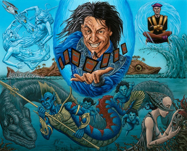
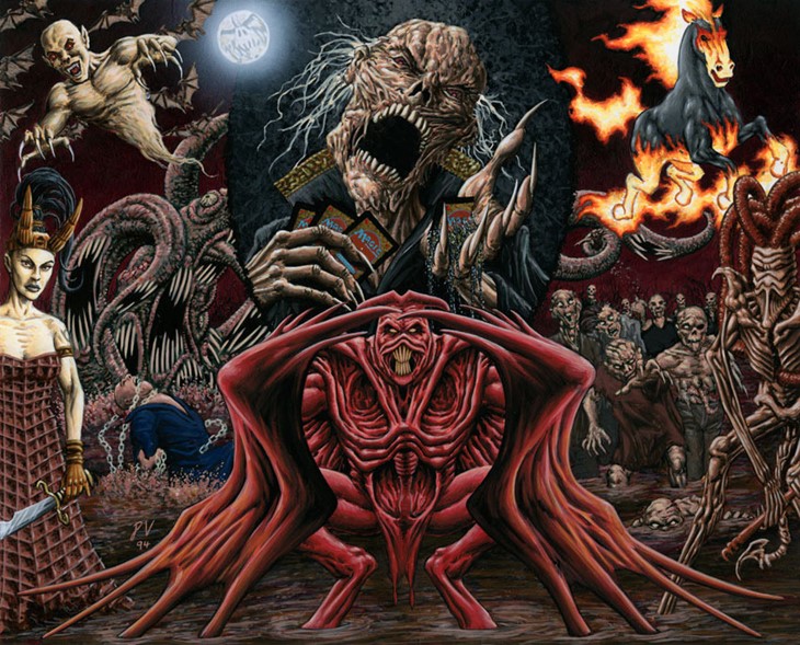
In 1994 you created a set of six promo pieces celebrating Magic’s first anniversary, one for each color and one for artifacts. It’s interesting to note the way you captured the spirit of each color, and how you successfully managed to make all these iconic creatures interact with each other, in such a complex composition. How did it feel to undertake such a challenging commission?
At that time, all the art was still copyrighted by the artists so I was trying to be very mindful of everyone’s designs. But mostly I remember just being swept up in how crazy cool the idea was. I love those potential interactions, that’s the storyteller in me showing again.
I got to do something similar for Unhinged’s Drawn Together where you can see Shauku has the poor little Cabal Trainee on a collar and chain, and the Lhurgoyf (that eats dead things) is trying to snack on a protesting Carnophage.
From an illustrator standpoint, what changed for the better and what changed for the worst since ’93?
Well, it’ll never stop sucking that Wizards chose to withdraw the royalties option for artists back in 1995. Yes, they started paying a larger upfront fee, but the royalties gave the artists a better income and I felt it was a good way to let the artists share in the success of the game.
I’m sad to see how much Wizards doubled down on a house style for the Magic brand. There are a few talents that escape this fate (the awesome Terese Nielsen comes to mind) but on the whole, I find it very hard to tell 80% of the illustrators apart.
To be clear, I think that modern-day Magic art is exceptional work produced by incredible talent, but the older work with its breadth of styles (and, yes, a broad range of talent) made for a more visually interesting product when those cards were spread out on a table. As individual pieces, Magic art has never looked better, as a set of cards it leaves me cold.
Do you think it would be possible to keep the streamlined worldbuilding and set coherence, while also encouraging a broad set of artistic styles?
Absolutely. It’s a weak world design that can’t survive stylistic variations. Magic worldbuilding is rock-solid and I don’t believe the decision to go with a more unified style has anything to do with concerns about communicating a setting. This timidity towards stylistic differences is down to marketing; they want a defined approach for branding purposes.
This unified look is how they tie it up in a bow for licensees but given how the game started and the breadth of fantasy art, I think it’s selling the players’ artistic tastes short.
What do you consider the defining factors behind the game’s longevity?
The fact that you can almost always find someone to play with. Magic was the first CCG, grabbed the lion’s share of players, and worked very hard to never let go. There have been many great CCGs over the years but most of them died because people gave up on the game when they couldn’t find other players.
I remember when Wizards started drawing up plans for the Pro Tour and it seemed like an incredibly risky undertaking but I think that without the organized play scene the game might have dwindled away to nothing by now.
Do you recall which were the hardest cards to paint?
Sometimes an art description could be a little hard to fathom, usually because it was trying to achieve too much in a single image. That would probably result in a number of iterative sketches and discussions with the AD, but usually, those issues were resolved before any paint ever touched the canvas.
For me the trickiest paintings were always ones where I was experimenting with light sources. Oftentimes it was new colors such as in Tahngarth’s Glare where I tried to capture the sky just before sunset. The shift in the blue and the pink of the clouds was a delicate balancing act.
I started as a comic artist and 90% of all the work I produced before age 21 was black and white. Color is something I had to learn and has never come naturally to me.
Of the five colors in the game, is there one you gravitate towards more, artistically speaking? I don’t want to lead your answer, but you did paint many more red and black cards than the rest of the colors”
Well, you pretty much hit the nail on the head. I would ask for more red and black cards because those were my favorites. My preferred colors (from most to least) are Black, Red, Green, White, Artifact, and Blue.
What are your favorite pieces you made for the game, and what are your favorites done by other artists?
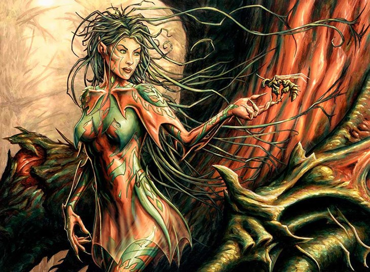
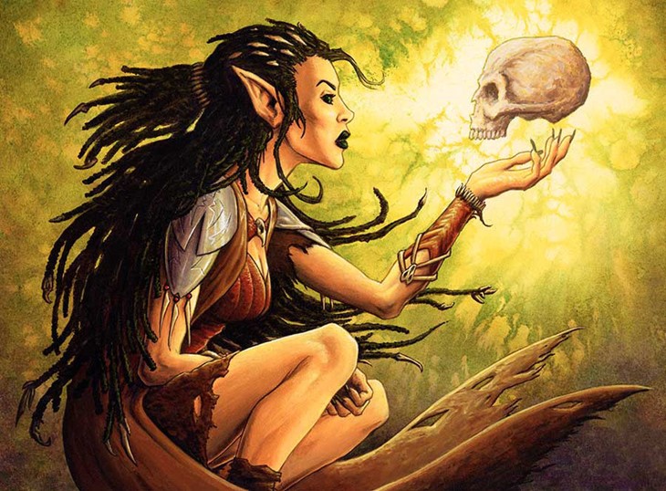
I have a lot of pieces so narrowing it down by categories Baron Sengir wins the nostalgia vote as he’s always been my most iconic piece, Tanglewalker was a rare opportunity to paint something attractive, Raksha Golden Cub was probably one of my best heroic pieces and Drawn Together was a very rare opportunity to do a retrospective of my work within Magic.
It was essentially a vanity piece that was also a commission and I spent three weeks painting it which is far in excess of what makes sense if you’re doing painting just to pay the bills!
As for other artists, I think there’s almost too much great art to narrow down individual pieces. I’m a big fan of Aleksi Briclot, Kev Walker, Terese Neilsen, and Mark Tedin (though don’t tell him that, he’ll never stop reminding me!). I know there’s other stuff too, way too much.
I stumbled upon peteventersproject.com while researching, that’s quite the dedication. I saw you were recently on GP Seattle and SCGCON. What feedback do you get from the players?
The most common feedback is that they miss the older style of art in the game. That’s a loaded response though because the people that prefer the newer stuff are probably not coming to my table to get cards signed so how that preference actually splits across the player base is anyone’s guess.
I get a lot of goblin enthusiasts – my Unglued goblin token is probably my most signed card this year – and a whole slew of people that wish WotC would reprint my version of Kiki Jiki.
Occasionally there are also people who want to talk about the world-building I did for Magic, and those tend to be long and fun conversations.
Is there any Magic-related story/episode you’d like to share with us?
Too many to just pick one. Catch me at a show. Anyone who’s chatted with me at the GPs can tell you I’m good for anecdotes.
Do you have a current project you’d like to plug in?
Funnily enough, no. So much of my stuff is tied up in NDAs. I know of a small something related to a popular videogame that’ll be out soon but I can’t speak about it yet. Apart from that, I have some projects of my own but they’re not ready to be revealed yet.
Recommended Posts
Adam Paquette Interview
Welcome to our MTG Artists Interview series There's no Magic without art. For this week's interview, we talked with Ad
Read More
Anson Maddocks Interview
Welcome to our MTG Artists Interview series There's no Magic without art. We're very happy to share with you our talk
Read More
Anthony Palumbo Interview
Welcome to our Artists Interview series - There's no Magic without art - where we talk to artists about their work on
Read More