Jason Engle Interview
Welcome to our Artist Interview series – There’s no Magic without art – where we talk to artists about their work on Magic: the Gathering.
Today we talk with Jason Engle, who has created some amazing art for Magic, and here’s what he told us.
You started making Magic cards about ten years ago, but long before that, you were doing covers for Dungeon Magazine (a magazine about D&D). Can you tell us a little about this period and how you got started?
I began my career as a graphic designer for a marketing company when I was just out of high school. I was fortunate to meet some like-minded people at this company, and together we co-founded a tabletop game publishing company back in 1999, and after a year of development, we debuted our first game at Gencon in the year 2000.
It was called Shards of the Stone, and it sold incredibly well at the show due to the revival of D&D with its 3rd edition, there was a craze for all things fantasy role-playing, and we kind of rode that wave for a short time. I was the only illustrator or artist really, on staff, so I produced the entire look for the game and all the art it contained.
The book was a hit at the show, and many other game companies picked up copies as well, and soon after I started getting freelance offers coming in from all over the industry. It was a great way to get started in the freelancing business and dropped me right into the deep end almost overnight.
After almost a year of freelancing, the art director at Dungeon contacted me about doing a cover. It was a big opportunity, and I assume they had simply seen my work around the industry by that point on other products, and it was a hell of a lot of fun to work on the magazine that I read as a kid playing D&D.
It really felt like the pinnacle of success very early in my career, and I was incredibly happy to have such a big opportunity. They also let me illustrate an interior article in that same issue, which was written for the world of Dragonlance, which was my favorite setting in the D&D multiverse as a kid, and it was written by Tracy Hickman himself!
I then went on to illustrate many more articles for both Dungeon and Dragon magazines, as well as create art for many of the main lines of D&D books and products for many years afterward.
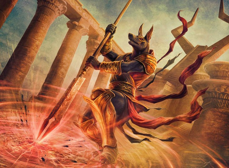
Can you give us a brief description of your painting process for Magic cards?
I start with composition. The art orders they provide are usually very comprehensive and include characters, visual references, the scene, and at least a suggestion for the background of the image. It is then up to me to find the best way to include all of these elements and present them in a way that clearly tells the story through the art and does so in the most compelling and aesthetically pleasing way possible.
The art on a card is fairly small, so it needs to be read clearly and easily. This means I spend a lot of time early on dealing with just shapes and forms, creating overlapping elements that don’t obscure too much to make anything identifiable, and just trying to construct as much of the bones of an image as possible to give myself a solid foundation, before I start doing any detail or color.

Once I have good composition, I move on to reference gathering. I compile images that give me useful information about anatomy, light, costume design, and texture. I then composite the elements together onto my compositional sketch, to get an idea of how these elements can work within the shapes I’ve defined.
I then turn to my drawing pad and begin the actual sketch. Once I have a drawing, or two, that I am happy with, I scan it in, and do a little light grey tone shading with a digital airbrush, to define the real basic darks and lights, so the art directors can get a sense of my overall lighting scheme. I then submit this to the art directors for approval.
Assuming everything gets green light from the directors, I then break out my grey tone paper and do a much larger, much more carefully rendered drawing. I use both black and white pencils for this stage, to start defining how the details and textures are affected by the very basic lighting I’ve been building up to that point. It’s more of a refining stage so that I have as much information as possible before I start laying in color.
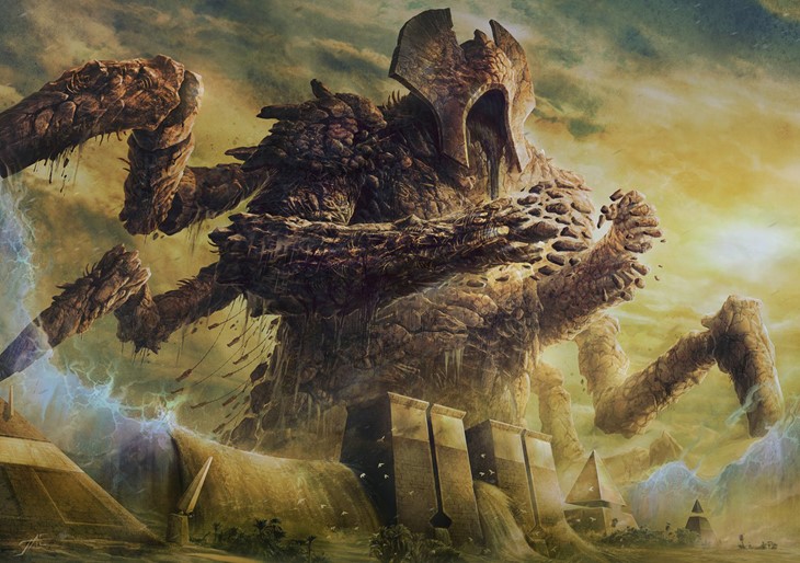
When the tonal drawing is done, I scan this drawing and then crop out the separate elements in Photoshop. I use the layering capabilities to add depth and patterns and work on rendering all the elements separately and bring all of the lights and darks to as much finish as possible. Then I start laying in color, re-touching elements that don’t quite have the right tone or texture once they are in color and begin overlaying textures and patterns and effects. Once all that is in place, I then start polishing everything until it all comes together.
All of this usually takes about two days. 1 for the sketch and compositional phase, and one for the rendering and color.
And even after all of that, I will usually hold onto the image for another day or two, to make sure nothing jumps out at me after I’ve had a chance to get away from the piece for a short time and can re-approach the image with fresh eyes. You’d be amazed how many times this has saved me from some weird anatomy, or wonky backgrounds.

In which way does the small card format condition the creative process?
It does necessitate a clear composition, and it does limit detail. That said, we still render all of the detail into an image just as we would on a piece of cover art, but we have to be aware of what does or doesn’t show up at the small size, so we can make certain there is still enough information to convey drama and action.
So, I will commonly zoom in and out of an image during the production process, to give me an idea of how it will look on the final card. It’s really like we are producing art for two images at once, a full-size poster, and a tiny little card, in the same piece of art.
What were some of the most challenging cards you painted, and why?
The first card I produced for Magic was Aether Flues, for Planechase. I’m not really an environment artist, and more of a character specialist, so while it was a great honor to finally get a chance to produce art for Magic, the game I had loved for so long, it was definitely a surprise when I read the art order.
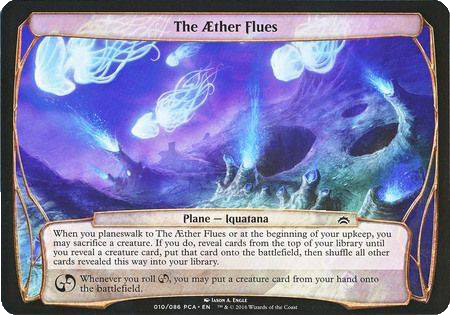
I had done a lot of work in fantasy game publishing and felt like this description (I’m paraphrasing here but this is the idea: a moon-like cratered planet surface full of blue energy geysers and glowing jellyfish flying overhead) was way outside my strike zone, but I did the best I could at the time. And in fairness, I still kind of like the art actually.
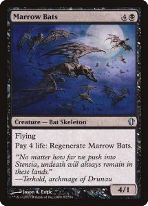
Bonebats though was one I’m not as fond of. It works alright, I just can’t help feeling I could have done a lot more with it.
On the other hand, which ones “immediately clicked”?
I got the description for it, and sat down to sketch it the same night after working on other projects all day, and just played around while watching TV. By the time I went to bed I had 4 different ideas that were all great. I drew them all up the next day, did the full sketch treatment, sent them to the art director (who was still Jarvis at that time), and he said “These are all great. Pick whichever one you want”.
And so, I did, and the rendering was just easy. It took a couple of extra days, because, all the plants and trees can do that, but it came together so well, and everything just worked on the first try, when it was done I knew it immediately. It just clicked, as you said.
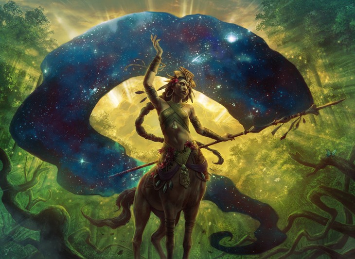
Of all the art you made for Magic, can you name some favorites?
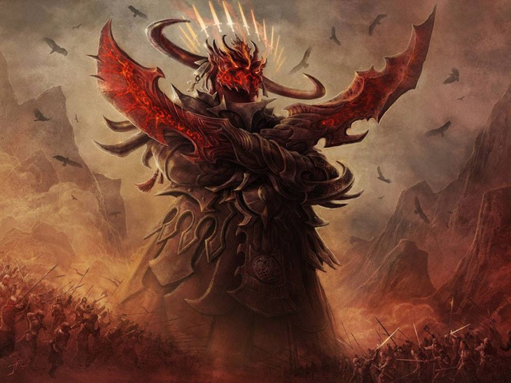
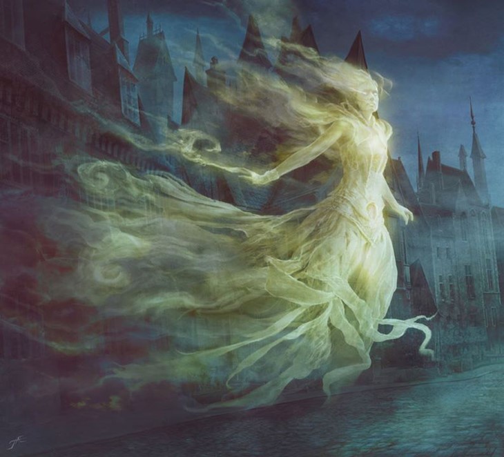
Avatar of Slaughter, Student of Ojutai, Herald of the Pantheon, Lord of Extinction, Yahenni’s Expertise. Oh, and the Spirit token from Return to Innistrad, something about that spirit girl and her smokey glowing dress, just really works well for that world.
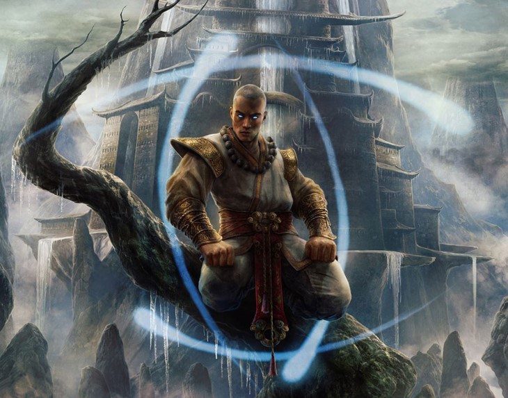
We want to thank Jason for the interview, and for being an awesome guy.
In the upcoming Dominaria expansion, you’ll be able to get your hands on the following cards done by Jason.
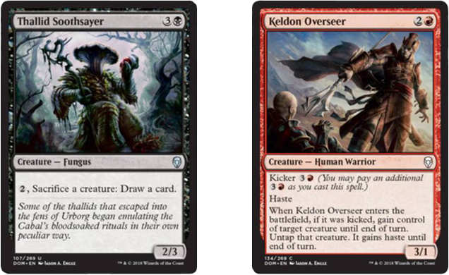
You can find more about Jason’s work on his website
Recommended Posts
Adam Paquette Interview
Welcome to our MTG Artists Interview series There's no Magic without art. For this week's interview, we talked with Ad
Read More
Anson Maddocks Interview
Welcome to our MTG Artists Interview series There's no Magic without art. We're very happy to share with you our talk
Read More
Anthony Palumbo Interview
Welcome to our Artists Interview series - There's no Magic without art - where we talk to artists about their work on
Read More